Have you tried using LinkedIn's document sharing feature to create LinkedIn carousel posts and boost your engagement? If not, you should!
Let me tell you why... LinkedIn carousel posts are awesome.
LinkedIn's top influencers like Gary Vaynerchuk use carousel posts to drive engagement, increase brand awareness and build community.
See this 👇🏼

It's a carousel by Gary Vee.
And the best...
He certainly had an awesome designer to do this for him, but Gary certainly didn't spend any ad dollars.
Still, not a bad engagement at all:
• 7 slides
• 26,252 likes
• 1,662 comments
LinkedIn's document sharing feature allows you to create carousel posts organically.
You can get a ton of organic engagement if you do it right and this post will give you all the ingredients you need to create awesome LinkedIn carousel posts that engage & convert.
This post gives you real-life examples from some of the savviest LinkedIn marketers & experts and also easy-to-follow best practices.
Interested?
Let's go.
What Are LinkedIn Carousel Posts?
(And Why Should You Care)
Not to confuse with LinkedIn Carousel Ads, carousel posts are documents that are shared on your LinkedIn feed.
LinkedIn has introduced the document sharing feature back in 2018 so it's not brand new, but still, more and more people are using this content type to drive engagement.
How it works is simple:
LinkedIn users can scroll through your presentations and documents without leaving LinkedIn.
Here's a great LinkedIn carousel post by Dennis Brown on 9 Lessons on How to Grow a Profitable Business.
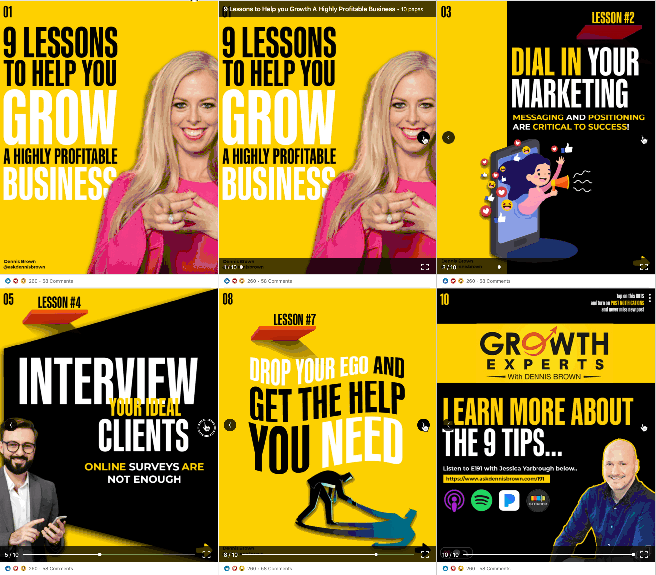
You can see why we call it LinkedIn Carousel Posts, can't you?
And this is hugely powerful.
Why?
Creating designs & visuals for your next LinkedIn post can turn your static text into engaging content that helps you gain awareness.
A little time and energy can mean the difference between a static page and growing your business.
According to the latest LinkedIn stats, the B2B (business to business) platform has 660 million users, with more than 303 million monthly active users.
Because carousel posts are interactive and have eye-catching graphic designs, they stand out from the newsfeed.
They also take a large real estate on your screen:
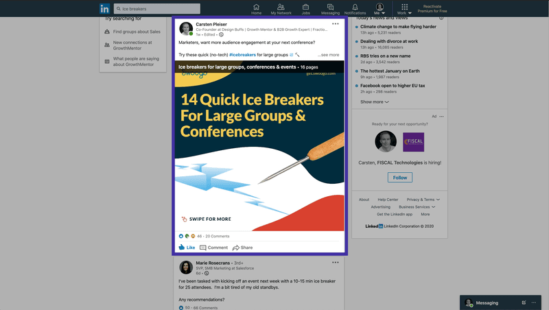
Finally, your content is not just limited to text but becomes tangible and encourages your audience to engage with your (personal) brand.
LinkedIn carousel posts allow you to show off your brand's personality, which draws your audience in and helps them to connect with you.
LinkedIn carousels are my new favorite way to promote my Growth Experts podcast. They’re eye-catching and easy to consume, users love them! - Dennis Brown
And the best, the posts are optimized for both, desktop & mobile.
OK, but how do they work and how can I post them?
How Do LinkedIn Carousel Posts Work & How Can I Post Them?
When you're making an update from your LinkedIn 'Home' page feed, you now have a third icon available enabling you to share documents.
Step 1) Start A New Post From Your Newsfeed

Alternatively, you can also find the document sharing button in the "Create a post" screen.
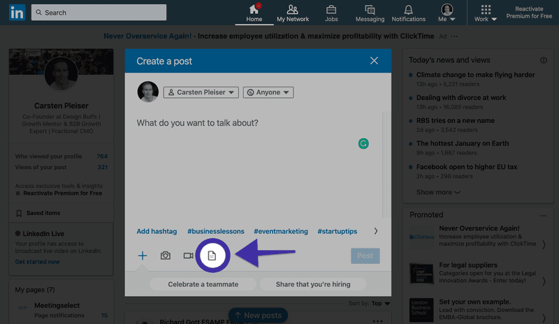
Step 2) Select The Document You'd Like to Share
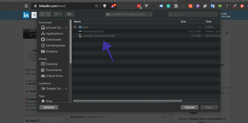
Step 3) Give Your Document a Descriptive Title
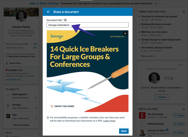
Step 4) Talk About It
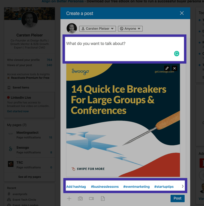
Voila.
Pretty simple, right?
Don't worry, we'll show you some examples and best practices later on.
But first...
What Are The Specs & Dimensions Of LinkedIn Carousel Posts?
When you start designing your LinkedIn carousel posts, you need to make sure that you follow the right specs.
You don't want your post to look like cr@p, do you?
Here are the most important specs to remember:
- Keep your file size below 100 MB
- You cannot exceed more than 300 pages (let's face it, you don't want that many slides anyway)
- The following file types are allowed: PPT, PPTX, DOC, DOCX & PDF
- Once the post is uploaded you can't change or edit the document
You should really save any file as a PDF to ensure higher quality.
Pro Tip: You can always look up the up-to-date information from LinkedIn directly if you need additional information.
What Formats Work Best For LinkedIn Carousel Posts (+ 7 Examples)?
While you can think outside the box, topics that work great for LinkedIn carousel posts are:
Example #1 - Share Stats, Numbers & Infographics
Brian Wallace, the found & owner of an infographic design agency, shows off his work by sharing examples & useful stats with the document sharing feature. He exports the infographic as PDF and then uploads them as a document to a LinkedIn post supporting the stats.
Here's an infographic on the Psychology of Color

Example #2 - Share Actionable Business Lessons
Here's an example by Travis Lachner, CEO of spark & spear: 5 Pro Lessons Learned From World of Warcraft - on the last slide you can see that Travis incorporated an arrow with a call to action encouraging people to leave a comment. Clever tactic!

"As attention spans shorten with time - concise headlines are the heroes of your slider. Make it easy to scan, and obvious what to do next." - Travis Lachner
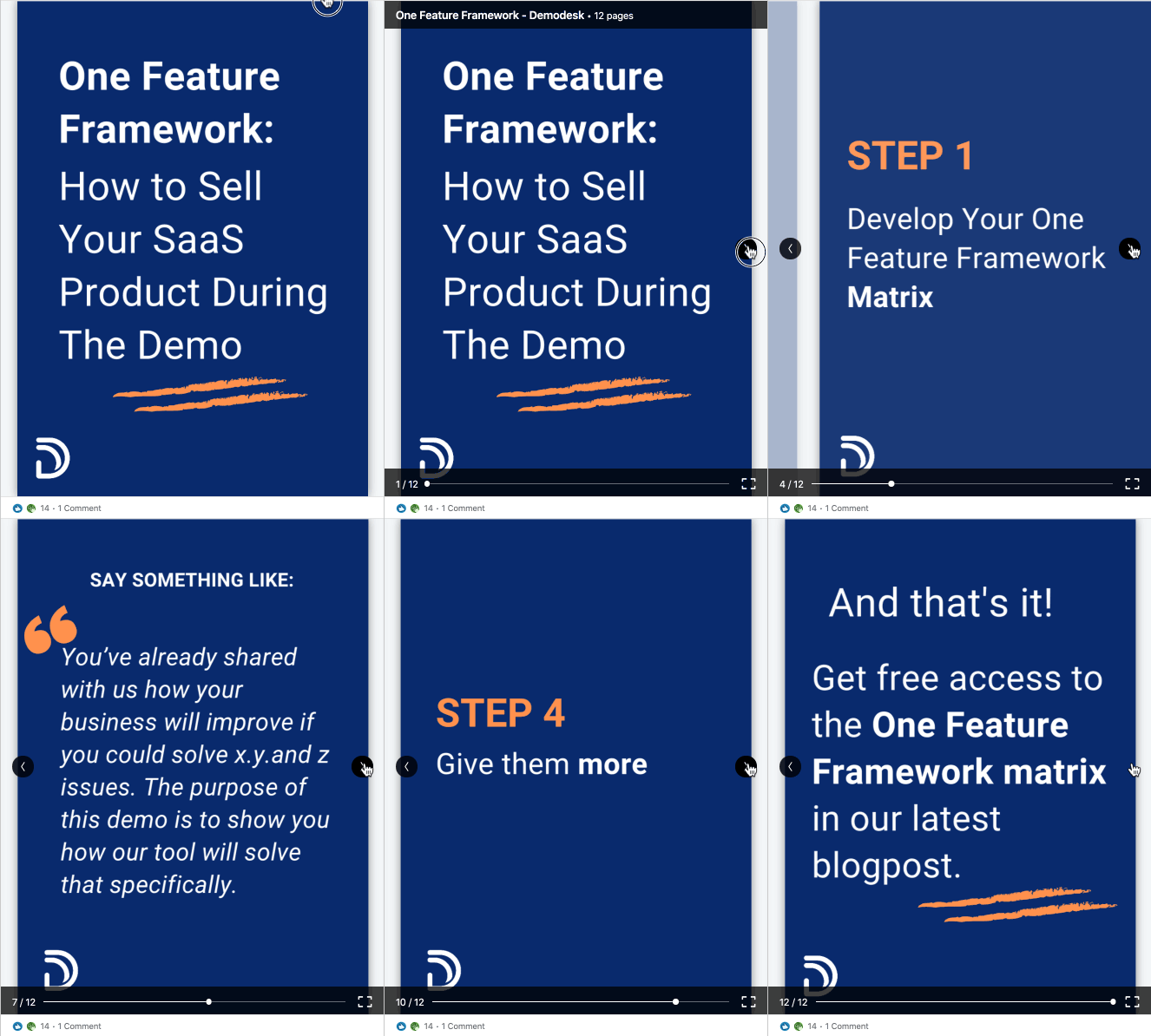
Example #3 - Frameworks & Step-By-Step Instructions
Demodesk is introducing the One Feature Framework through a visual that explains step-by-step how it works.
Pro Tip: You can also share documents from your company page, which make it the ideal place to share case studies, frameworks, business reports and anything else company related.
Example #4 - Step-By-Step Instructions
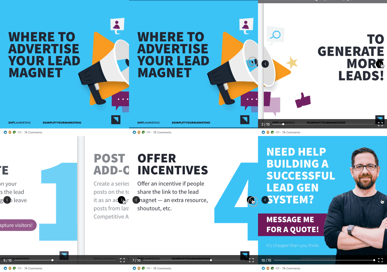
Actionable tips are so powerful, here's another example by Jason Vana: "How to build a successful lead magnet".
You see that you don't need a hell of a lot of information, but if you can give the key highlights of valuable content. What we really like about Jason's design is its simplicity.
Example #5 - Event Content & Conference Slides
Seriously, more conference organizers & speakers should use LinkedIn to market their event. Carousel posts are the perfect way to share conference content with your audience.
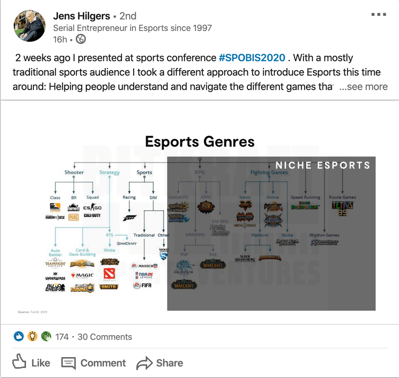
Here's an example by Jens Hilgers, an eSports entrepreneur helping to understand and navigate the game's landscape.
Or simply, make your audience aware of an upcoming CFO & Executive Conference, as Gartner did here:
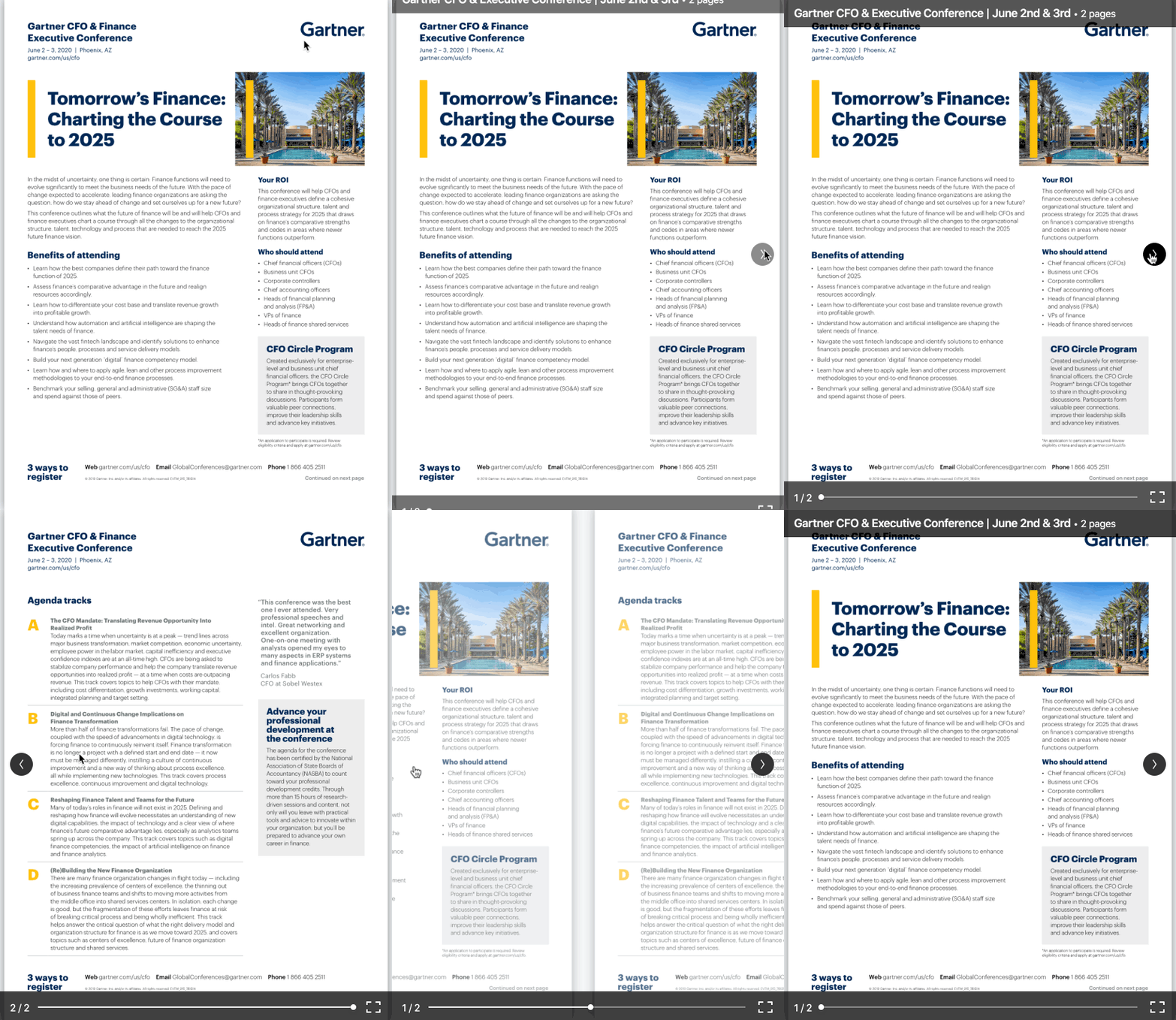
Great job, Team Gartner 😊
Example #6 - Promote Your Content
Matheos Simou, a recruitment brand strategist & graphic designer, shares his "No-BS" thoughts on outsourcing graphic design & branding:
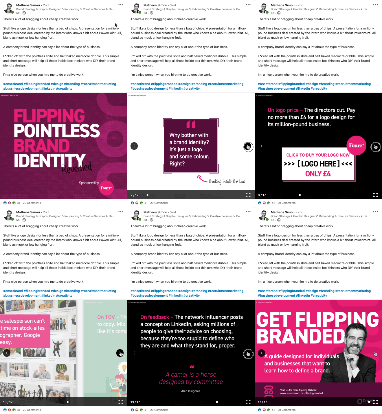
Pretty cool slides.
His post, Flipping Pointless Brand Identity, really hits the mark when it comes to educating his audience on the importance of branding & graphic design.
Example #7 - Listicles From Your Blog
Listicles aren't necessarily a brand new concept. In fact, they have been around for decades and played a major role in the development of content marketing. Sites like Buzzfeed & Co. carried the trend-forward and made long-form content fast, fun & easy to read.
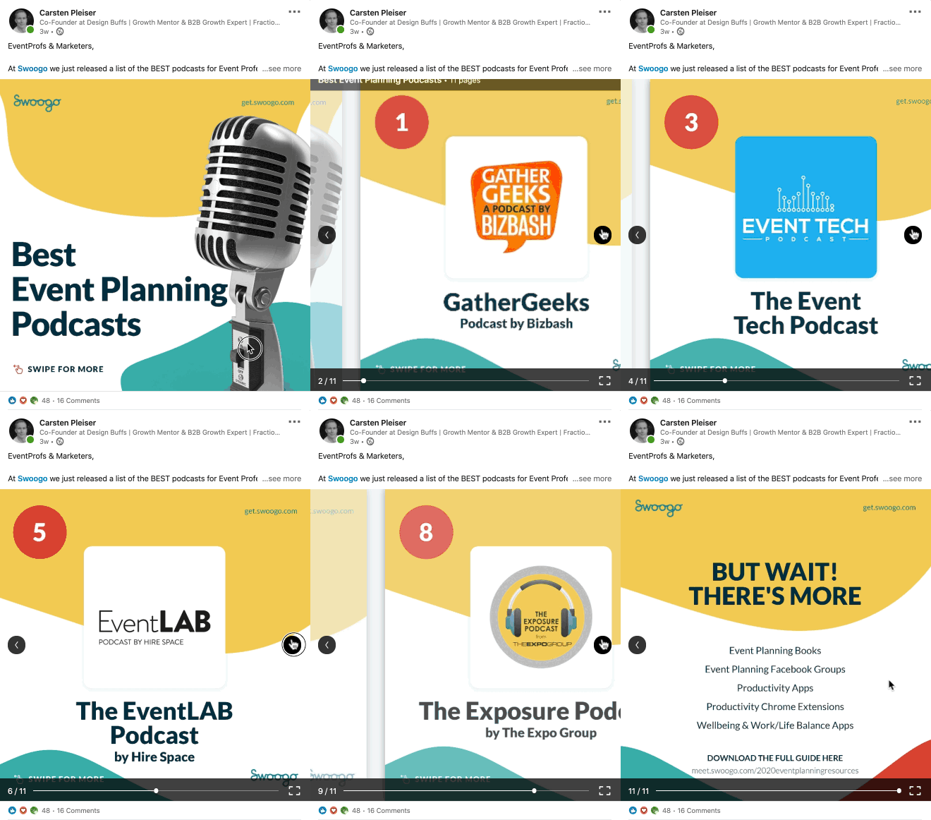
Here's one I did for Swoogo Event Marketing Software repurposing the blog content into a few slides to showcase some of the best event planning podcasts in the events industry.
Example #8 - Use Custom Designs & Illustrations
Otter.ai published a LinkedIn carousel post on their company page about remote work tools (see below) and utilized illustrations and custom designs to share the message:
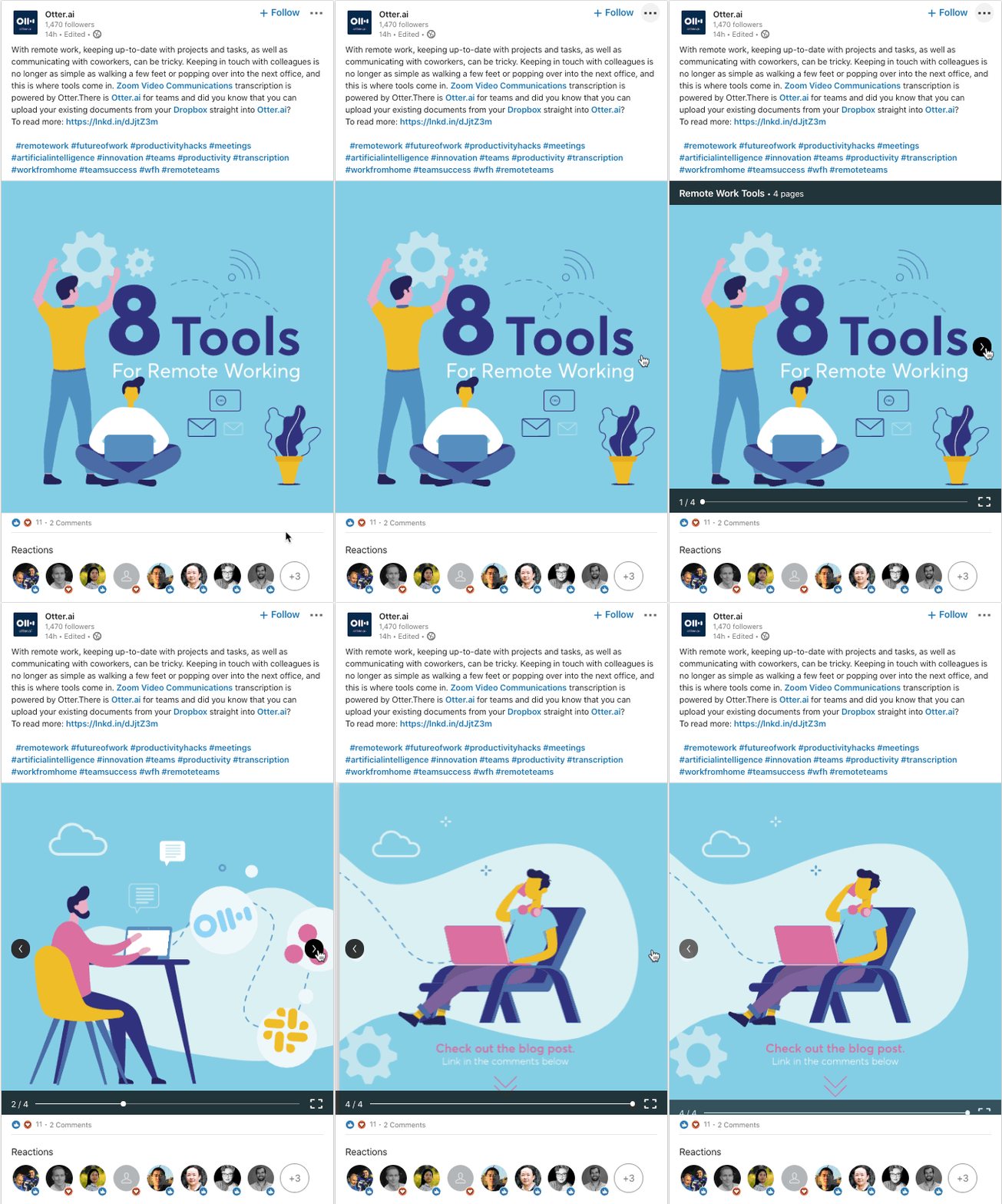
"LinkedIn carousel posts work because it's a very easy and visual way of consuming information (visuals are processed 60,000 times faster than text), but at the same time, it always needs to be original, interesting, and well designed. Mediocre won't do it, just like any other kind of content." - Marta Olszewska (Content Marketing Consultant)
When I compare posts of my client, 3 types do well:
- posts with photos of the team and company culture behind the scenes (extremely well!)
- downloadable kits, cheat sheets and resources
- the slideshow post
Let's explore best practices next, shall we?
What Are The Best Practices for LinkedIn Carousel Posts?
ZenGrowth's Marta Olszewska said that three types of posts work do well:
- Posts with photos of your team and company culture
- Downloadable kits cheat sheets and resources
- Slideshow posts
It all depends on your overall engagement as an individual or as a company and if you're adding value to the conversation.
Here are some additional best practices.
Best Practice #1 - Start With A Powerful First Slide
You can't expect your audience to be intrigued just by words, e.g. your title or introduction is often not enough. You want to draw them in with a powerful visual that grabs the attention.

Just like everything in marketing (design), the AIDA principle also applies to LinkedIn Carousel Slides.
The acronym AIDA is a handy tool for ensuring your design and your copy grab the attention of your audience.
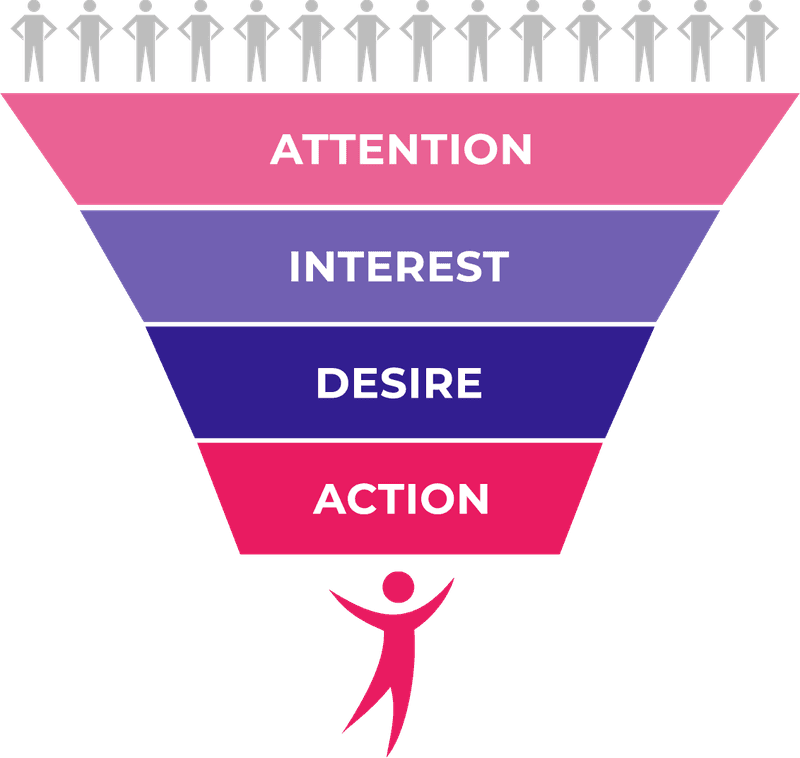
The acronym stands for:
- Attention (or Attraction): Create a powerful first slide that encourages people to click through. You can grab attention by using powerful colors that stand out from the LinkedIn feed or visuals of real people also work well.
- Interest: Once you grabbed the attention of your audience you need to keep them engaged. A question on the second slide can work well to get people interested in your topic.
- Desire: Let's say you're looking to build your personal brand on LinkedIn, people want to know how they can best apply the skills outlined in your document to their own lives.
- Action: Finally, you want people to do something: "Download an eBook, schedule a call, start a trial, etc."
Your first slide has to be "Wooooowwww". Think of it as a video thumbnail: you’re telling part of the whole story in just one frame, so choose wisely and be bold.
Best Practice #2 - Don't Use Videos or Other Animations
LinkedIn's document sharing feature doesn't support animations or videos within your slides. It will only display static images instead, so keep that in mind.
Best Practice #3 - Optimize For Mobile & Create Micro-Conversions
On LinkedIn, a Like, Comment & Share can go a long way. If possible, you want to create a design that encourages people to act on those.
Dennis Brown, again, does this nicely

He then also calls people to like, comment, share or save the post.
Visual cues are especially important to cater to mobile users. According to the latest LinkedIn marketing stats, there are 63 million unique users on mobile - every month. Mobile is booming and the number is climbing every month.
Make it easy for them to swipe, click, comment, follow or turn on post notifications.
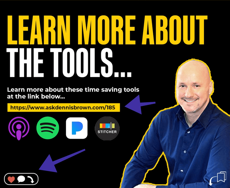
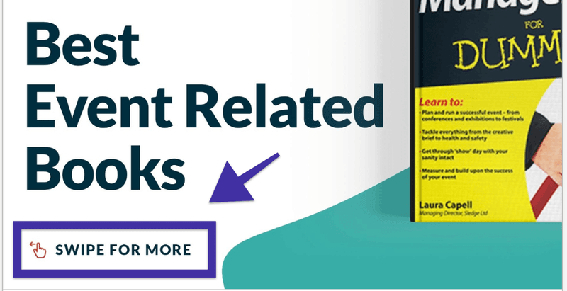
You definitely want to incorporate some of these elements into your design. At the minimum, a simple "Swipe for more" with a thumb interaction or something like this.
Here's an example 👇🏼
Makes sense?
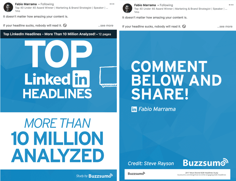
Best Practice #4 - Cut The Fluff & Make It Easy
No one really reads long slides. LinkedIn carousel posts are not made for long-form text content. According to Nielsen Norman Group, people scan through content in an F-Shape pattern.
This means that the first line of text on a page receives more views than subsequent lines of text. The first few words on the left of each line receive more fixation that subsequent words.
What does that mean for the design?
Keep your headlines bold & strong and maintain visual hierarchy to guide people through your content;
Best Practice #5 - Keep It Authentic & Personal
Pavlos Rizos, one of my marketing friends on LinkedIn, does it really well. He keeps the language conversational and gives his LinkedIn carousel posts a personal touch by adding high-quality profile shots.
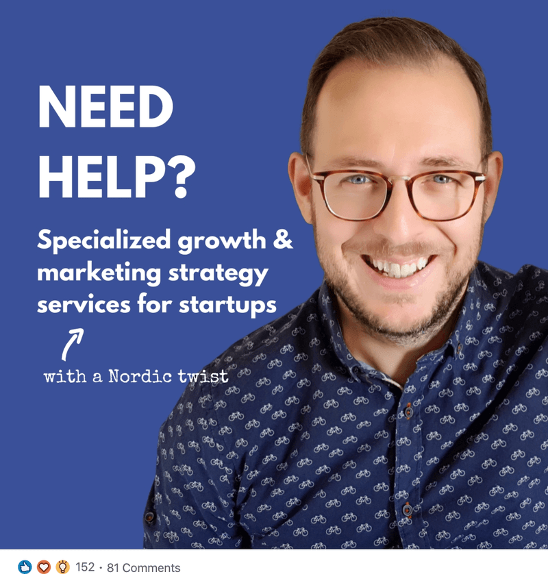
"Keep it personal and informal, while you share your value. This helps your audience feel more engaged with you and your content. And this usually triggers the start of new interesting relationships. This is what LinkedIn is for, right?" - Pavlos Rizos
Other Best Practices for LinkedIn Carousel Posts
- Convert files to PDFs whenever possible to ensure good quality
- PDFs with multiple layers must be flattened or merged
- PDFs with multiple sized pages must be fit to the same page size
- Always add a title to your document to let members know what your document is all about
- Share high-quality documents that reflect how members already use LinkedIn to find new opportunities and make new connections
How Do I Design LinkedIn Carousel Posts
Well, you have a few options here.
Most people use Canva or Photoshop to design carousel posts....We design everything ourselves. It depends on what resources you have available.
If you have an in-house design team, that's great. If you're on your own (and have time), use Canva. If you don't have the time, you don't have an in-house design team, and you want something unique to your brand, use an unlimited graphic design service like Design Buffs.
Canva is fine for basic design needs.
The problem with Canva, you can't really do any photo editing. But when you're building out your personal brand, images & pictures of you are important. You want to show your real self, not just a faceless brand.
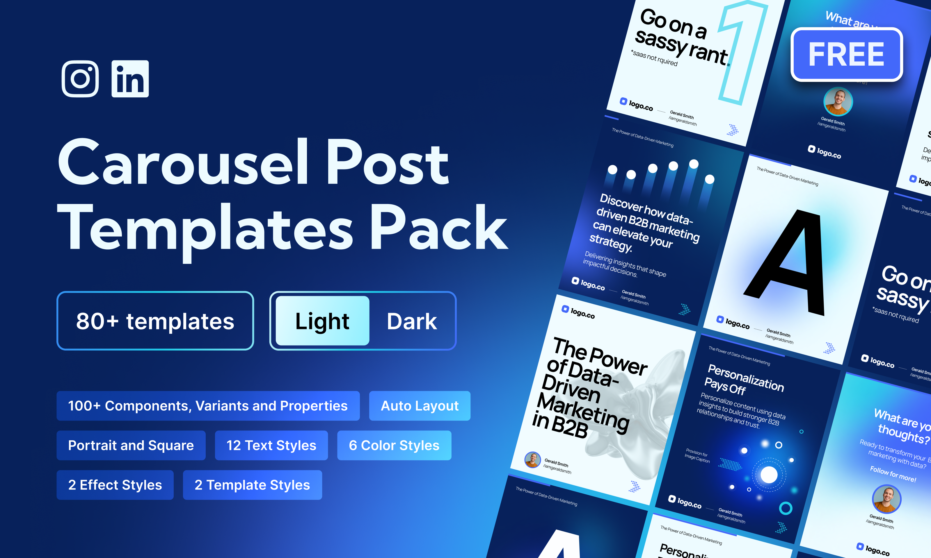
At Design Buffs, we have created a free Figma library you can copy and clone to get started.
Wrapping Up
If you've been wondering how you can increase your engagement on LinkedIn without diving head over heels to video, you can start sharing your expertise via LinkedIn carousel posts that can help you generate new opportunities for your (personal) brand or business.
Whether you decide to share "How to articles", share checklists, repurpose blog content, share conference slides or infographics, LinkedIn carousel posts are a powerful way to bring the LinkedIn community together and share your knowledge that serves everyone.
Remember to pay special attention to the design, the layout, and the structure. Only then will you be able to reap the full benefits of this beautiful medium.


