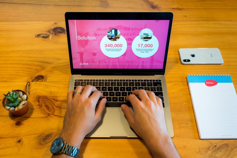
PowerPoint continues to be a mainstay in most organisations.
And for good reason! PowerPoint (PPT) presentations can be the secret weapon that turns a simple investment pitch, internal knowledge update, or sales deck into something no one can ignore.
There’s an almost endless number of ways to utilise a PPT presentation. But after decades of “death by PowerPoint”, your audience might be a little wary of watching them.
With that in mind, let’s look at how to create truly engaging presentations with 12 PPT design tips from the experts at Design Buffs.
12 PPT design tips for design-savvy businesses
Resist the allure of the ‘Dissolve’ transition and hold fire on that eighth bullet point. Just because PowerPoint has all the design features and capabilities you could need, that doesn’t mean you need to use them.

Follow these simple but effective PPT design tips, instead, and you’ll be delivering PowerPoint presentations that keep everyone engaged.
PPT Design Tip 1: Use text sparingly
The point of a PowerPoint is to power your presentation. It’s supposed to be a visual tool that supports what you’re saying. So why do so many people insist on packing their slides full of text?
The text you use in your presentation shouldn’t be exactly what you’re saying out loud. Use text to emphasise key points or provide further context to your speech at a glance.
PPT Design Tip 2: Follow the 6x6 rule
One of the most common problems we see on PPT presentations is an overwhelming amount of text — normally accompanied by the presenter reading out the very same words. That’s not what PowerPoint is for.
The rule of thumb for how much text to include per slide is what we call the 6x6 rule.
Slides should have no more than 6 lines of text, with no more than 6 words per line. This helps to reinforce your main points rather than distracting your audience by giving them a novel to read on the screen.
PPT Design Tip 3: Keep your text readable
This may seem like an obvious PPT design tip, but how many times have you been forced to watch a presentation backed with Papyrus and Jokerman fonts? Sure, it can add a little character to your presentation, but it’s far from professional.
Any text that does make it onto your presentation should be an appropriate size and font. We recommend around 32pt, sans serif fonts to ensure it’s easy to read for everyone. Use colour to pick out keywords and limit punctuation (yes, we mean no use (or overuse) of exclamation marks!).
PPT Design Tip 4: Make single points, not paragraphs
If your piece of text takes more than a couple of seconds to read, remove it. Because when your audience is busy reading, they aren’t listening to what you’re saying.
For your message to land, you need to keep your audience’s focus. So instead of paragraphs of text, use simple, single, sentences — and consider a bullet point format.
PPT Design Tip 5: Stick to the natural reading order
Most Western languages read from left to right.
You’re doing it as you skim-read this article right now!
So make sure your PPT design is empathetic to skimmers — put the most important words at the start of the sentence and display titles in a larger font, to the top left of your main text.
PPT Design Tip 6: Keep slide design simple
Pretty is good. Pretty looks appealing. But what makes a PowerPoint great or not is more about graphic design than illustration.
Consistency and clarity are key for a PowerPoint presentation. Create a simple design template and stick to that theme for each slide. This helps your audience to understand your presentation better as they can look in the same areas on each slide to receive information.
PPT Design Tip 7: Avoid too many special effects
PowerPoint is full of really cool features and special effects, but use too many and your impactful presentation quickly turns into a dated 80’s sitcom.
Treat special effects, like transitions and animations, as you would any other component of your slide deck. Use them sparingly — that way, when you do throw out a text fly-in or funky transition, it serves a real purpose.
PPT Design Tip 8: Use high-quality images
It’s time to ditch the clip art. We’ve all seen the built-in, cookie-cutter clip art images a million times by now. Not only are we tired of seeing them, but they offer next-to-no impact at all.
Any images you use in a presentation should be top quality. That means having relevant meaning and high enough resolution. If you’re unsure if an image you want to use will cut it, simply test the slide on the projector. Does it pixelate? If you remove the text from the slide, can the visual still carry the message? It’s better to be safe than sorry!
PPT Design Tip 9: Keep everything relevant
Speaking of relevance… a slideshow should be a tool that supports your main message. It’s a facilitation technique, and the design is not supposed to take centre stage.
As such, everything in your PowerPoint should be relevant to the points you’re trying to make. Each graphic, piece of text, transition and animation should reflect what you’re saying.
This will help keep your audience’s focus.
PPT Design Tip 10: Don’t be afraid of “empty” space
Just like silence in a conversation, too many people rush to fill empty space. In a PPT presentation, this results in a cluttered, confusing chart deck — one that totally detracts from the point you’re trying to make.

Try to leave at least a third of each chart empty. We dare you!
PPT Design Tip 11: Back off the colours
Less is also more when it comes to your colour palette.
Bright colours may grab attention, but too much can overwhelm your audience. And multicoloured text reduces readability, especially at a distance. Stick to dark text on a light background, or light text on a dark background, to ensure maximum readability.
Most companies will have specific design guidelines for their official documentation. This often indicates suitable colours for any B2B communication, including PowerPoint presentations.
PPT Design Tip 12: Speed up loading times with optimised images
Waiting for a slide to load is a sure-fire way of tanking your presentation flow.
Before you know it, you’re trying to fill the gap with small talk or a terrible joke. Not only is this incredibly awkward for everyone involved, but it can undermine your message.
It might be tempting to just drag-and-drop images into your PPT straight from your desktop or the web. But this simple method could also be your downfall, as the slideshow becomes clogged with too high-resolution images and large, heavy file sizes.
We recommend optimising your images to fit the presentation format you will be using. If you’re using an HD Projector, for example, you should compress your images to a HD setting of 330 PPI.
If you’re printing your slideshow to be passed around the audience, compressing the images to 220 PPI does the trick.
Ditch the guesswork and get your PowerPoints up to speed
If any of these PPT design tips flew over your head, don’t panic. Design Buffs offer support to B2B marketing and sales teams, no matter how big or small they may be.
We’ll take responsibility for font sizes, image optimisation and everything else so that you can stand up in front of your audience and get yourself heard.


